


Purple rain, purple rain. Purple rain, purple rain
I only wanted to see you, Bathing in the purple rain
This song by Prince may just get stuck in your head. With me, it does, as it is an iconic song from my childhood. It's about the end of the world, so not very cheerful. He connects purple not with happy states, but with an ominous purple sky.
But what's interesting is how this song came about. It was actually a country song, but when guitarist Wendy Melvoin improvised with some firmer chords, it became more of a rock ballad.
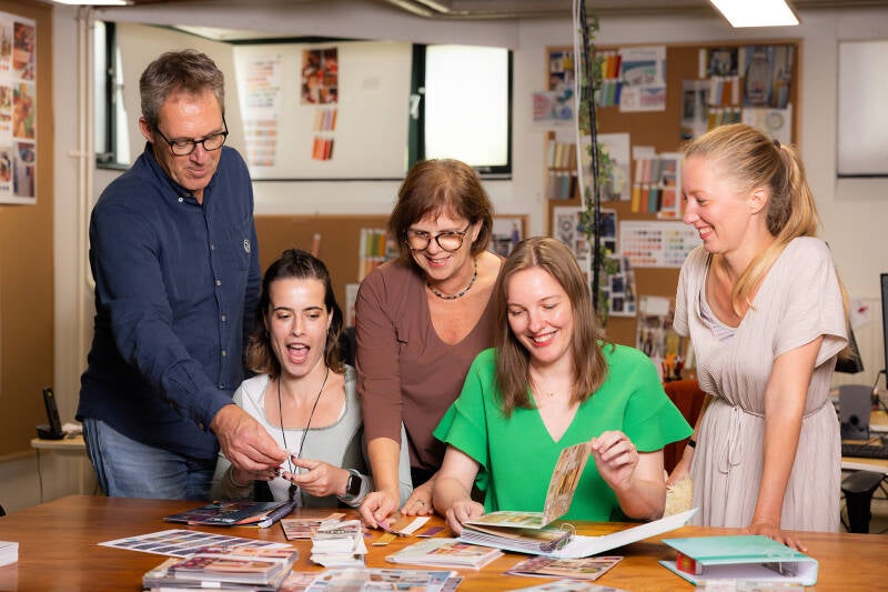
It's the same way with our color and trend photo selection for the Color Concept. From mood boards, we try different combinations. Someone throws in something, and suddenly we look at each other and say, yes, that's it! Like Prince had, we have too: a wonderfully creative team.
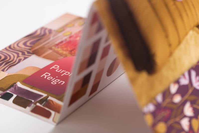
Our color & trend harmony Purple Reign is much more cheerful than Prince's and aims at a positive future. We remain optimistic and create the most beautiful inspiration and colors to work with in the coming years.
The compact folding sheets have remained, and since last season in a convenient ring binder.
We've also included a little more text this time. As you have come to expect from us, we are more focused on showing you visually what will work well in the coming years.
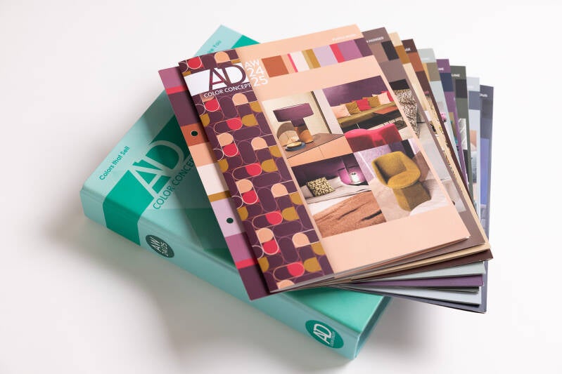
AW24/25 is so wonderfully inspiring and easy to use, here with the Purple Reign on top
We've also included a little more text this time. As you have come to expect from us, we are more focused on showing you visually what will work well in the coming years.
On Purple Reign we wrote:
A powerful color story that commands attention. Warm purple tones are paired with salmon pink and earthy hues, creating a captivating combination. A raspberry pink adds vibrancy, while a curry yellow accent adds a touch of spice. This color group strikes a balance between femininity and strength, with the earth tones and curry preventing it from becoming overly sweet. It exudes true women power, making a bold statement without backing down.
Martin used ChatGPT to get initial input for these descriptions. That went pretty well.
All in all, AI produces pretty good texts, but you have to know very well what to ask. And adapt things to keep it close to your own style. 😉

In addition to the 9 color harmonies, you get the overview of the 72 Pantone colors sorted by color family (above in the image). So handy if you are looking for a nice red shade, for example. Or to create completely new combinations yourself.
So happy when your team can start working with the latest Color Concept. 😀
Anyway, if you don't have it yet, order that wonderful package right now. And enjoy instant inspiration whenever you need it. You will do yourself a great favor. I speak from experience.
Have a great day!
Astrid Davidse
AD Design <> Color <> Presentation
astrid@astriddavidse.com
www.astriddavidse.com <> www.colorconcept.shop <> www.addesign.academy
T: +31 70 306 06 23
Add comment
Comments