

Every time, that question. How do you make such a color group? And then nine color groups?
What is nice is that it is always a question that follows: "what beautiful colors together" or "wow, nice colors." Mostly at fairs, where we can show our Color Concept in its full glory.
Importantly, colors don't want to be alone: they like to be in company.
When being helped in a clothing store, color-matching garments are quickly pulled from the (color sorted) rack: "and then add a blouse like this", or "this scarf completes it".
Does that work for you too ? Do you buy more than when you look by yourself, without help?
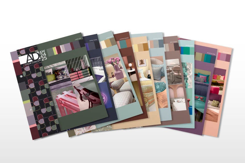
It certainly works that way with our Color Concept color groups. We call them color harmonies, colors that "hang together on the rack" because it looks attractive and makes choosing nice combinations easier.
And that is exactly what our Color Concept does do for us, and for our clients.

The Color Concept team, Yodi, Kelly and I @work at Milan Design Week 2023
OK, so how do we make attractive color groups? And for completeness, the whole "project Color Concept" that we go through twice a year:
1:
Foremost, it's a matter of looking a lot. No surprise there. At design shows, in design stores, in museums and exhibitions, and of course online. But no matter where you are, as a design and color specialist, you are always on and soaking up information like a sponge.
2:
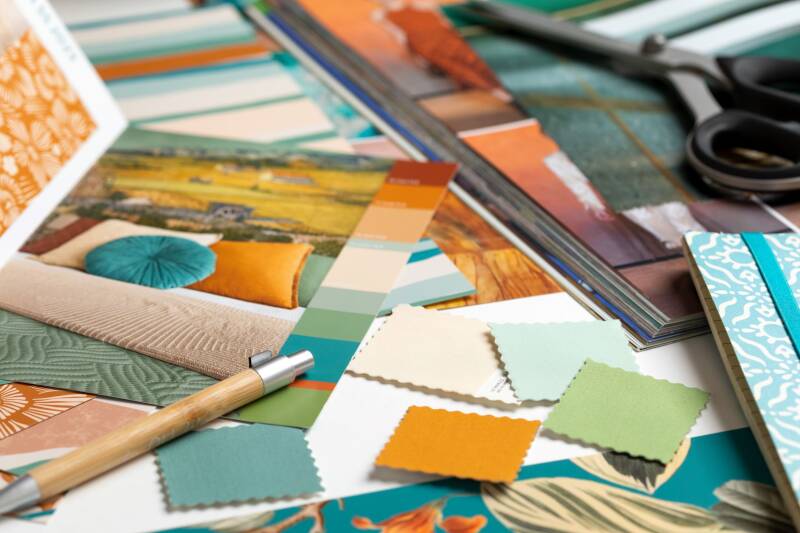
We collect (photos) everything beautiful for home. This is an experience and talent thingy, though. Taste too. But always influenced by our feeling and experience of what works well and what doesn't. It's all about functional aesthetics, fitting within our goal: the most beautiful, but commercially sensible on-trend interior colors to work with. Colors for home & interiors evolve slowly, so crucial to pick out those changes.
3:
All images are divided into 10 different mood boards. Such a nice phase, matching images in each board.
4:
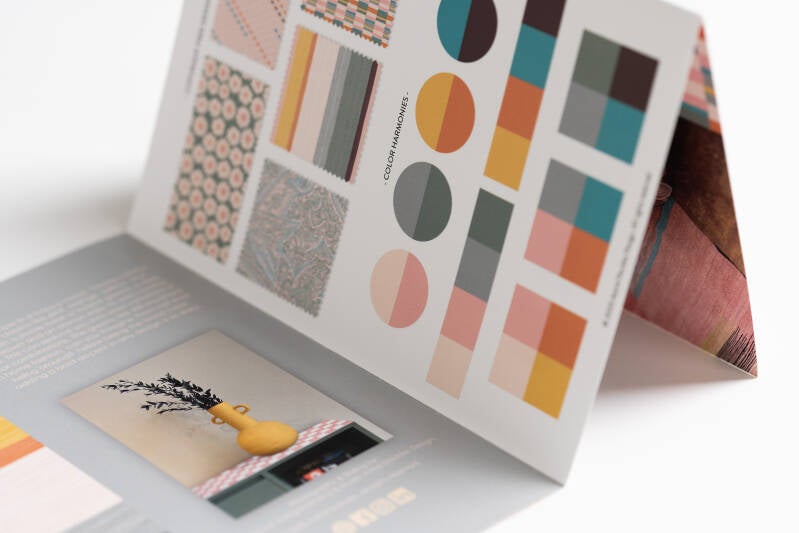
Then we open our treasure box of thousands of Pantone colors and pick roughly 10 Pantone TCX colors per mood board that go well together. As said, they should fit any combination of, say, 2, 4, or 6. And then finally we choose the 8 we are going to include.
See image below, where we show how easily you can vary within a Color Concept of 8 colors.
5:
Now the right pictures come with it. These days we take them ourselves at the shows and in stores. We edit them, especially to match them perfectly with our chosen color harmony, and we turn ourselves into graphic designers (luckily Yodi is trained for that) to finish the whole formatting.
Above you can see that we regularly include a painting (here van Gogh) whose insanely beautiful colors then fit perfectly. Unfortunately, not this time.
6:
Presentation to all freelance designers. With the feedback, we still make minor adjustments. Above all, it is a treat for everyone to see the new color groups and start working with them. Initially, this was the reason for creating the Color Concept. All designers upload the new colors in Photoshop and can work superfast with beautiful trend colors. As a result, I never have to (re)color designs from freelancers myself.
7:
We select the 5 designs from our collection to add to each Color Concept. By doing so, we show how very different designs can be colored with any color harmony. It's also a full test of the colors in practice. If something does not go well, the colors can still be adjusted.
8:
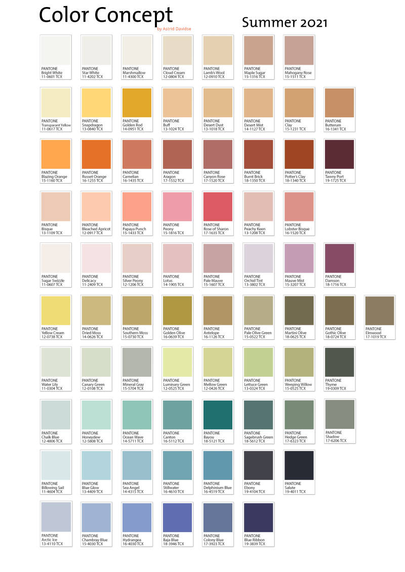
For several years, I have also created a Pantone overview. By sorting the 72+ colors by color family, you get a whole new perspective. So convenient if you are just looking for a certain hue. I use this overview daily myself. See an example below:
9:
It's time to schedule an appointment with the print shop. Nasty noise and endless fiddling with my Pantone cards and dozens of proofs to get the best possible colors on paper. So far this has worked out fine, but the number of printers where this can be done is dwindling fast.

10.
An important highlight for our customers: we can send the digital files of the Color Concept to the customers. So the full PDF, the Pantone sheet, the digital color palettes, and the 5 free designs in all color variations in 300dpi tiff files. So a huge ZIP file.
11.
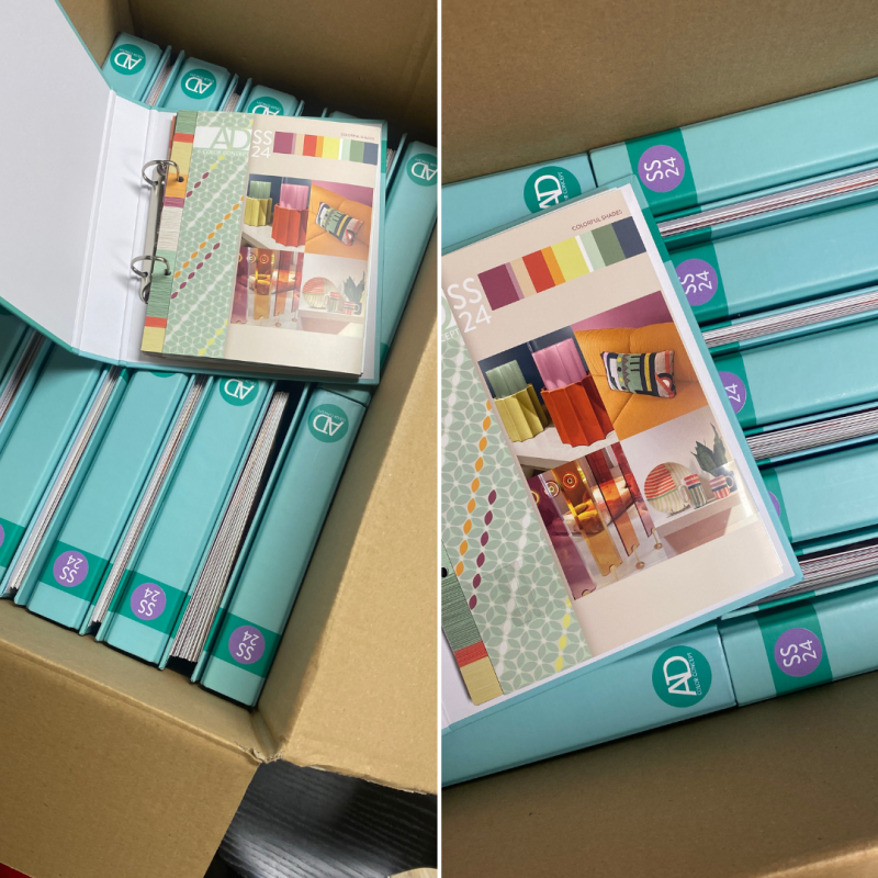
Happy moment. The delivery of the final Color Concepts! Now we can start delivering the printed version.
Since the spring/summer 2024 edition, we have a ring binder instead of the i-padsleeve. A bit more practical in everyday use. We get a lot 👍 for it.
We're so happy to work with these ourselves. It almost feels like cheating, when we choose and color designs and collections so fast, without much hesitation.
Do you also want a full set of Color Harmonies you can actually work with? Be inspired instantly, when you need it?
Have a kick-start when discussing trends and colors with your team and your clients?
Come and get the brand new Color Concept AW24/25! Go to the SHOP, and simply order the most practical inspiration and color guide, exclusively for home textiles and interior products.
You will get the digital files within one day, and we'll start shipping the printed edition soon after. You'll get a track & trace notice for this.
Save time and enjoy the result of our 11 steps!
Have a colorful day!
Add comment
Comments