

In interior design, we have been saying for a long time, green is the new black. And it will stay that way for a while. In fashion, black is back. And how. The most recent Chanel catwalk looks are dominated by black colors.
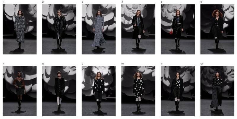
Images from Chanel.com: fall/winter 23-24
In general, black has always been a popular color in fashion and is often associated with elegance, sophistication, and versatility.
Next to Chanel, in the past we've seen fashion labels that are known for using black in their designs, like Alexander Wang, Balenciaga, Givenchy, Helmut Lang, Saint Laurent, The Row, Versace, and Yamamoto.
These labels have a reputation for creating designs that are both timeless and edgy, and they typically use black to add depth and drama.

Balenciaga used lots of "Spanish Black", as I witnessed in an impressive exhibition in our local museum
But let's get back inside. As much as I enjoy the extremer fashion collections, I have always been very realistic in what to take "home". So, same here. How to work with black in interior and home colors?
First, we never have 100% true black in any of the Color Concepts we published. But, we do have "almost" or "close to" black colors. In the AW23/24 edition, we had 10 of those.
Let me give you some examples.
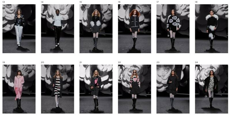
In the above Color Concept "Not Just Grey" (AW23/24), we used Pantone color "Dark Shadow" in a line-art design and in a graphical floral design. Both designs are copy-right free and included in the Color Concept package.
So we use "almost black" mostly as accents, or as an elegance enhancer. In the above color palette, it prevents blandness.
As in Fashion, black is often a washed-out kind of black, like the Pantone "Jet Set", here in Color Concept "Crimson Wood":

Crimson Wood is a very different example. Here, "almost black" is a more equal partner to the obvious main character "Bossa Nova" red and the 4 different brown shades in this color harmony.

And yes, we use these almost blacks more in the Autumn/Winter seasons. But occasionally we have dark brown or dark blue in a Spring/Summer edition too. Like above, Color Concept "Walking on Sunshine" (Spring/Summer 2024), where we use Pantone "French Roast", a very dark warm brown. Here it is a striking contrast in the palette.
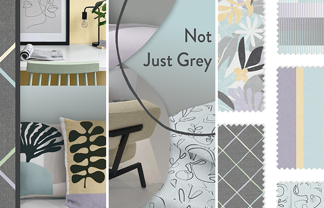
Having said this, I do think gray and "grayish" influences in (and on) colors, like you see in the above color palette, is more important for interior than black.
I love to look at sources of inspiration with a broad perspective. Never off, always open to be inspired. I invest a lot of time and money in travelling to shows and cities for this. Taking thousands of images.
As a result, I have my own wonderful color harmonies to work with, and I also offer these to you as the Color Concept. So you don't have to do everything I do to have the overview of trends and colors for each season. Or you can use it as a supplement to your own research.
Add comment
Comments