

Do annual 'Color of the Year' announcements influence your color choices?
Working with trend colors every day, I take these yearly 'highlights' for granted. For me, it is more about combinations of colors. And variations in color groups. That's what makes products and collections look great!
But then it's primarily PR promotion. Pantone uses it to communicate wider than B2B. And all bloggers, newsletter writers, and other media eagerly include it in their feed. Let's say it gets noticed and shared in a big way. So it definitely helps to sell lots of coffee-mugs in Classic Blue!
Right now there is a lot of echo about 'blue.' Clients ask how that works with that blue color that is so important this year.
I'm like, sure, blue is essential. It's in our Color Concept color groups for 2021. Same in those for 2020. Oh yes, and in 2019 too. Long before Pantone suddenly put Classic Blue in the spotlight.
So our customers had already applied those colors and are therefore entirely 'on-trend.'
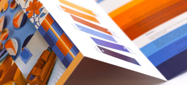

I can continue for a while. Of the 9 color groups for 2021, only 3 are without a blue shade.
So, craving for blues? Just go to our webshop and get them! Or tell me what your color issue is and we'll help you solve it.
Did I mention that these brand new color groups work like a dream? So happy when I start coloring designs again. Our clients responded so enthusiastically at the bizarre busy Heimtextil a few weeks ago. Love it when my efforts are appreciated and professional designers like to work with our color inspiration. Makes me very proud!
Colorful greetings!
Astrid
PS, let me know if you have any questions!
Add comment
Comments